Divya Gulechha

Divya Gulechha Cinnamon Design Studio | Banjara Hills, Hyderabad
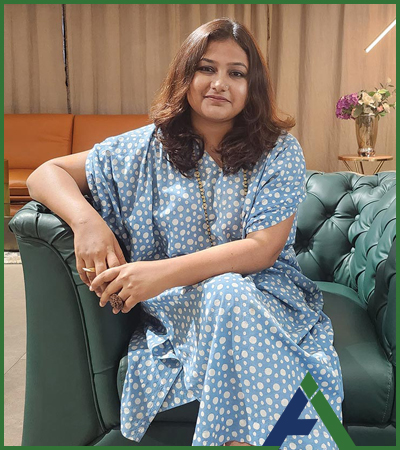
Divya Gulechha is a visionary architect and the driving force behind Cinnamon Design Studio. Armed with a Master’s degree in Architectural Design from the prestigious Mies Foundation in Barcelona, Divya’s designs are a symphony of harmonious interactions between the constructed environment and the natural world. Her journey as an architect is deeply entwined with her passion for blending India’s rich architectural traditions, both ancient and contemporary, with global design perspectives.
At the heart of Divya’s creations lies her admiration for architectural luminaries such as Geoffrey Bawa, Laurie Baker, and Charles Correa, whose philosophies resonate in her work. Not confined by geographical boundaries,
Divya draws inspiration from iconic figures like Bjarke Ingels and Frank Lloyd Wright, harnessing their innovative ideologies to enrich her design vocabulary.
Yet, her greatest muse is the city of Hyderabad, where she is deeply rooted. Divya’s fascination with its history and contemporary pulse drives her to keenly observe and document the nuances of daily life. This intimate relationship with her city infuses a distinct sense of place into her designs, capturing Hyderabad’s essence and spirit.
Cinnamon Design Studio, under Divya’s visionary leadership, is a haven of passion-driven architectural and interior design. Rejecting the constraints of labels, the studio thrives on an unbounded creative ethos that defies categorization. The studio’s ethos is a celebration of lines, a devotion to the power of purposeful architecture that can transform spaces into living narratives.
With a firm belief in the transformative prowess of intelligent design solutions, Cinnamon Design Studio is dedicated to crafting spaces that evolve, adapt, and tell stories. Divya Gulechha’s architectural journey is a testament to her dedication to creating spaces that transcend style, embody culture, and ignite the
imagination.
Luxury Haven

A boutique retreat for discerning décor enthusiasts designed by Divya Gulecha


The entrance area of the store is designed for a harmonious transition for visitors from the outside world to the captivating realm of the showroom within. The essence of the store’s identity is elegantly expressed through the thoughtfully designed logo and signage, seamlessly blending with the overall architecture. Circular motifs grace various elements, including the carefully crafted main door, evoking a sense of unity and coherence throughout the space.


As you step through the main door, an informal lounge welcomes the visitors to relax before embarking on their exploration of the store’s offerings. A small pantry offers an opportunity to make your coffee making the visitors feel as though you have stepped into the comfort of their own home.
The display area with two distinct chairs, presents a versatile space that can easily adapt to change. It offers a canvas where any accessory can be added, dramatically transforming the ambience of the area with each new addition. One of the chairs exudes a hint of rugged charm, showcasing a treasure chest adorned with cushions and other captivating items. This arrangement serves as a captivating display, evoking a sense of adventure and wonder. On the other hand, the second chair embodies an ever-evolving character, continually refreshing its appearance with each visit to the store, featuring new and exciting elements that entice and surprise customers.
The formal area is where the intricacies of design selection and idea brainstorming unfold in tandem with architects. A automated curtain gracefully encloses the area, tailored with the store’s own fabrics. A display of curtains on the side unveils a world of creative possibilities where clients can effortlessly experiment with combinations, pairing thin cotton with sumptuous fabrics, igniting design inspirations at every turn.
The in-house designer’s area is located at the other end of the space and has a lively pop of orange colour, as a soft board made from the store’s own fabric. This space offers the perfect setting for clients to sit down with the designer and seek personalized guidance.

The arch inside mirrors the design and style of its entryway counterpart, creating a harmonious and familiar atmosphere. The use of glass not only offers customers glimpses of the outside world but also bathes the store in a gentle  infusion of natural light. Adjacent to this arch, is a pantry, where customers can indulge in a  refreshing coffee experience before embarking on their selection and buying journey. Coffee mugs proudly bear the brand’s logo, seamlessly weaving the brand identity into every moment of the store experience.

The entrance door is entirely crafted from scrap materials sourced on-site, even the fabric used was repurposed from leftover scraps. Handcrafted with lime plaster, the arches outside, have glass panels, offering glimpses into the treasures that await within the store.
Muted tones dominate the entire flooring made of green tiles that flow seamlessly without any prints or designs. Similarly, the ceiling with no elements added to it echoes this simplicity. The profile lights, running in straight lines across the ceiling, serve as subtle visual guides, gently leading visitors further into the heart of the store.Every furniture piece is custom-designed using the fabrics and materials available at the store. The cone-shaped table features a gracefully engraved concrete top with the brand’s name and logo. A captivating wooden beaded chandelier dangles gracefully, complementing the ambience of this unique setting.
A grand 12-foot table, featuring a bluish concrete top, graces the semi-formal lounge, meant to hold numerous catalogues. The purpose of this table is to accommodate the process of selecting fabrics and curtains, as customers often need to match various items together to find the right curtain for their room. The table here is also designed in a cone shape, proudly bearing the brand logo atop, akin to its counterparts in the informal lounge. The chairs are custom-made using the store’s own fabrics, the display racks are custom-made at the site and the flooring here continues from the informal area, creating a sense of continuity throughout the space.
A table with a green top, mirroring the green flooring gracefully extends throughout the entire space of the formal discussion area. A wall-mounted TV serves as a valuable tool for understanding the unique requirements of each client, enabling them to tailor their offerings to meet the client’s exact needs and preferences.
Share it :

Leave a Reply

Your email address will not be published. Required fields are marked *

Stay Updated with Hyderabad's Design Excellence.

Categories

Latest Post